Home › Start here › Dashboard › Map and statistics ›
Map and statistics
This article provides detailed information about the dashboard and teaches how to view statistical information.
Make sure that you have registered applications in the system.
-
Log in as administrator with any set of permissions.
-
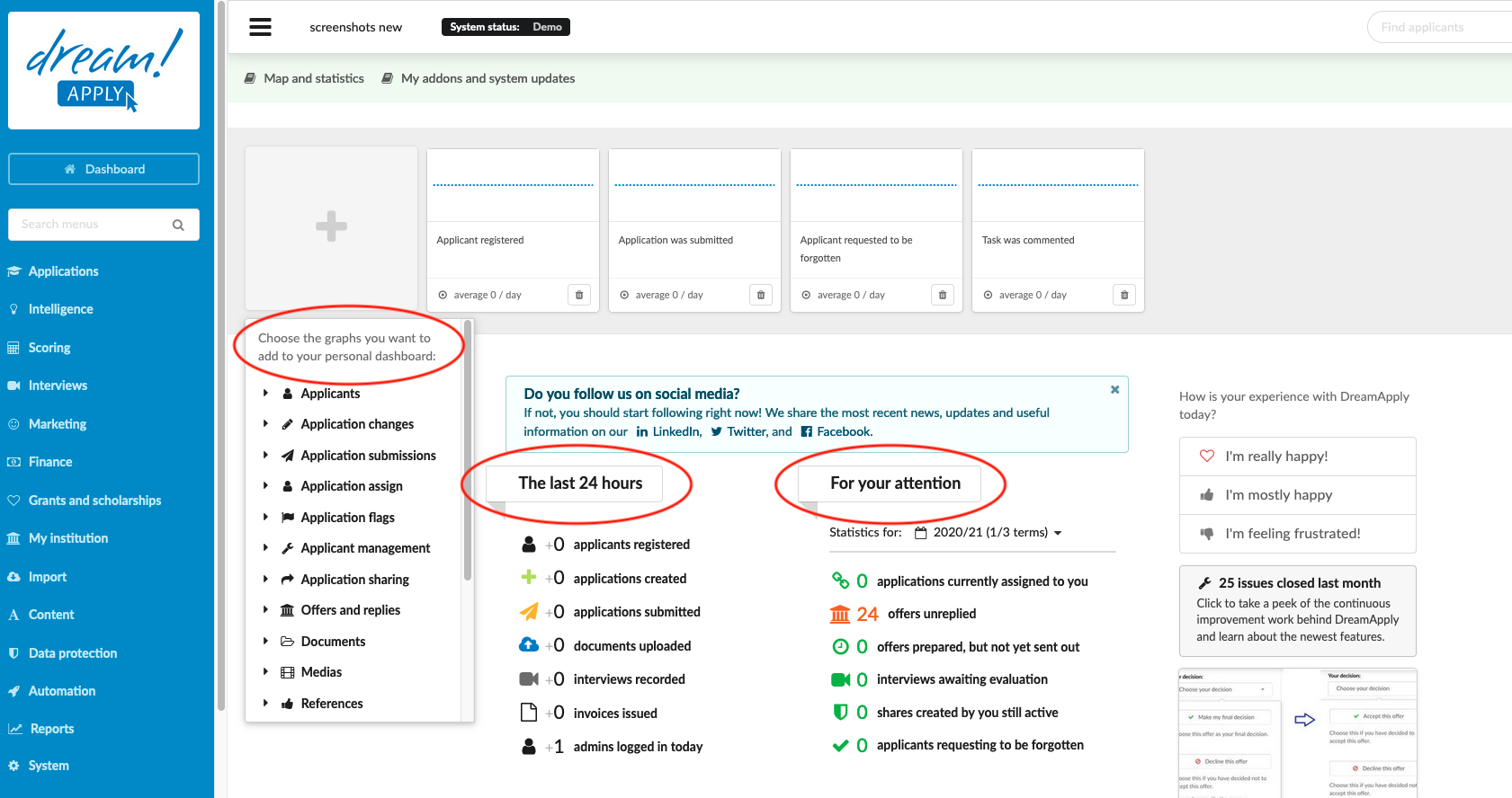
The first page after logging in is the Dashboard. Otherwise navigate there from the Main menu by clicking on the “Dashboard” button.
-
Interact with the Graph widgets:
-
To add a Graph widget of a selected Event.
-
Click on the “+” button.
-
Select the desired Event from the dropdown list.
-
-
There is room for eight Graph widgets at the top of the page, clicking on the “Garbage can” button will free up a spot so that the “+” button reappears.
-
The resulting widgets provide information about daily activities in the system. By clicking on the Graph widgets, you can follow up on the Events from the Journal.
-
-
Explore Recent Activities and Statistics:
-
The “Last 24 Hours” section provides a snapshot of the most recent activities within the system. By clicking on each individual “activity,” you will be seamlessly redirected to the “Journal” tab, where you can access comprehensive and detailed information about each event.
-
The “For Your Attention” section offers essential statistical insights for each academic semester. You have the flexibility to filter and refine the data based on your specific academic semester preferences,
-
-
Interact with the Map, Calendar, Funnels, and Responses:
-
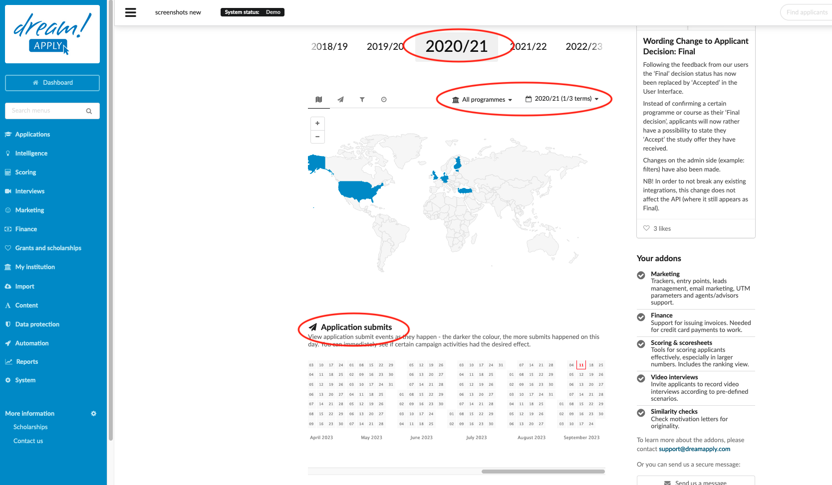
The Map displays the countries from which applicants are applying.
-
Hover the mouse over a country to see the number of applicants who have submitted an applicant in a tooltip.
-
Adjust the filter to see applicants based on the academic Terms.
-
-
The calendar serves as a visual representation of submission-related information, allowing you to stay up-to-date with application submission events as they occur.
- Within the calendar, the intensity of color indicates the volume of submissions on any given day. This visual cue provides instant insights into the effectiveness of specific campaign activities, helping you gauge their impact at a glance.
-
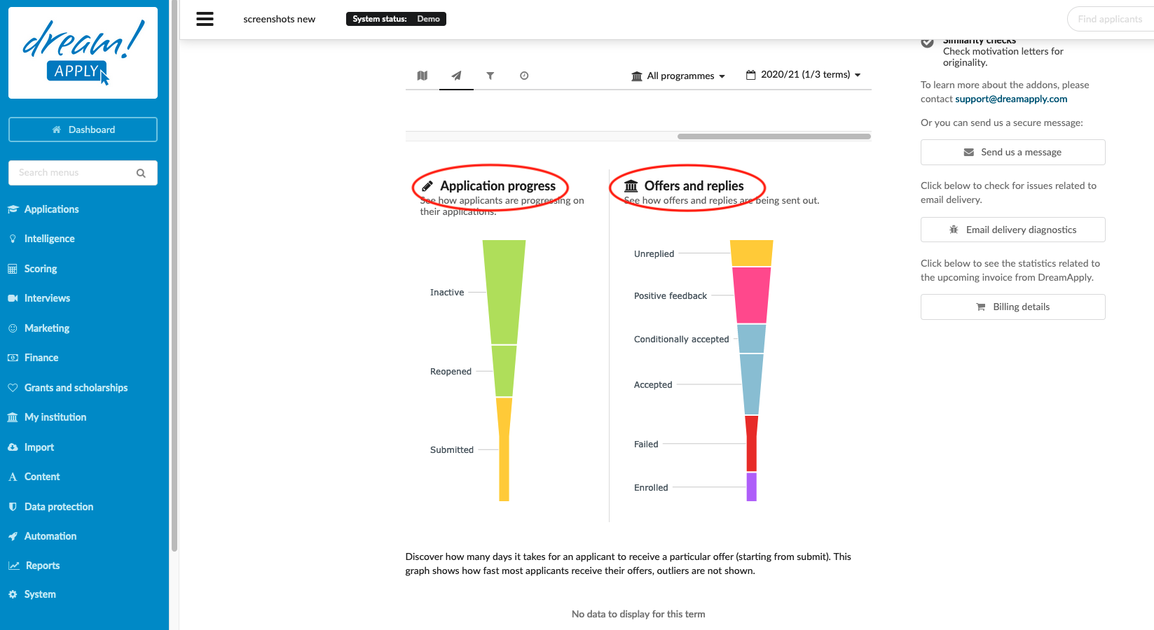
The Applicant progress Funnel shows a visual representation of the progress of the Application.
- Hover the mouse over an Applicant progress status to see the number of applicants in that status in a tooltip.
-
The Offers and replies Funnel shows a visual representation of the progress of the Application’s Offers and replies.
- Hover the mouse over an Offer status to see the number of offers in that status in a tooltip.
-
The Responses shows how many days it takes for an applicant to receive an offer (starting from submit). This graph shows how fast most of the applicants receive their offers. Outliers are not shown.
- Hover the mouse over the box graph of an offer status to see the details about how long it takes an applicant to receive an offer of that status on average.
-
By checking the dashboard, you can always find out general information about ongoing processes in the system with a quick glance.
Where can I find my addons and updates about DreamApply?